Logo Design
The previous North Summit Recreation logo was dated and looked as though it has been created in Microsoft Word. This logo revamp kept the same principal with mountains, but added a modern look to it. The previous logo could only be printed in color while the new revamp allows the logo to be printed in black and white and still be legible.

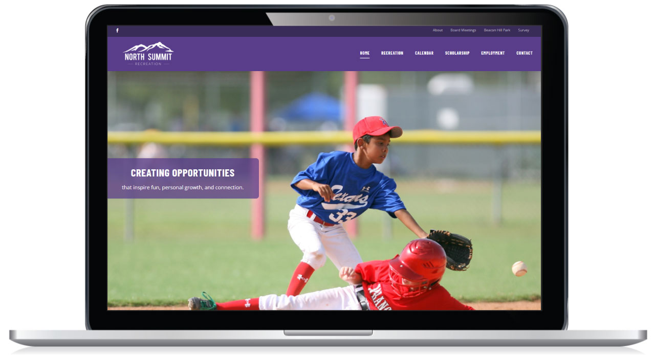
The design of the North Summit Recreation website uses the main color of the local high school. It is laid out in such a way that users can find registration, schedules and team information quickly.
The primary objective for the North Summit Recreational website was to create a central place to post current and up to date information and registration links in an organized way. Their previous website used a variety of fonts, font sizes, and text colors in an effort to make information stand out. That method led to a confusing unorganized website. We created a design and standard layout for all sports.
Since the North Summit Recreation website is primarily an informational website it doesn’t have too many special features. That being said the website is organized in such a way that it makes relevant information easy to find.