Do you have a project that you are looking for the perfect fonts to use? Deciding what fonts work well and complement each other can be a time consuming and difficult task. I am excited to share with you 6 different FREE fonts combinations for personal and demo use. All of these fonts can be installed on your computer to be used in any Cricut or Silhouette project. Not sure how to download fonts? Follow my step by step tutorial on How to Download and Install Fonts to Your Computer. Once these fonts have been installed onto your computer they can be used for your home decor and DIY Cricut projects in Cricut’s Design space. See my How to use FREE fonts in Cricut Design Space tutorial if you are unsure how to do that.


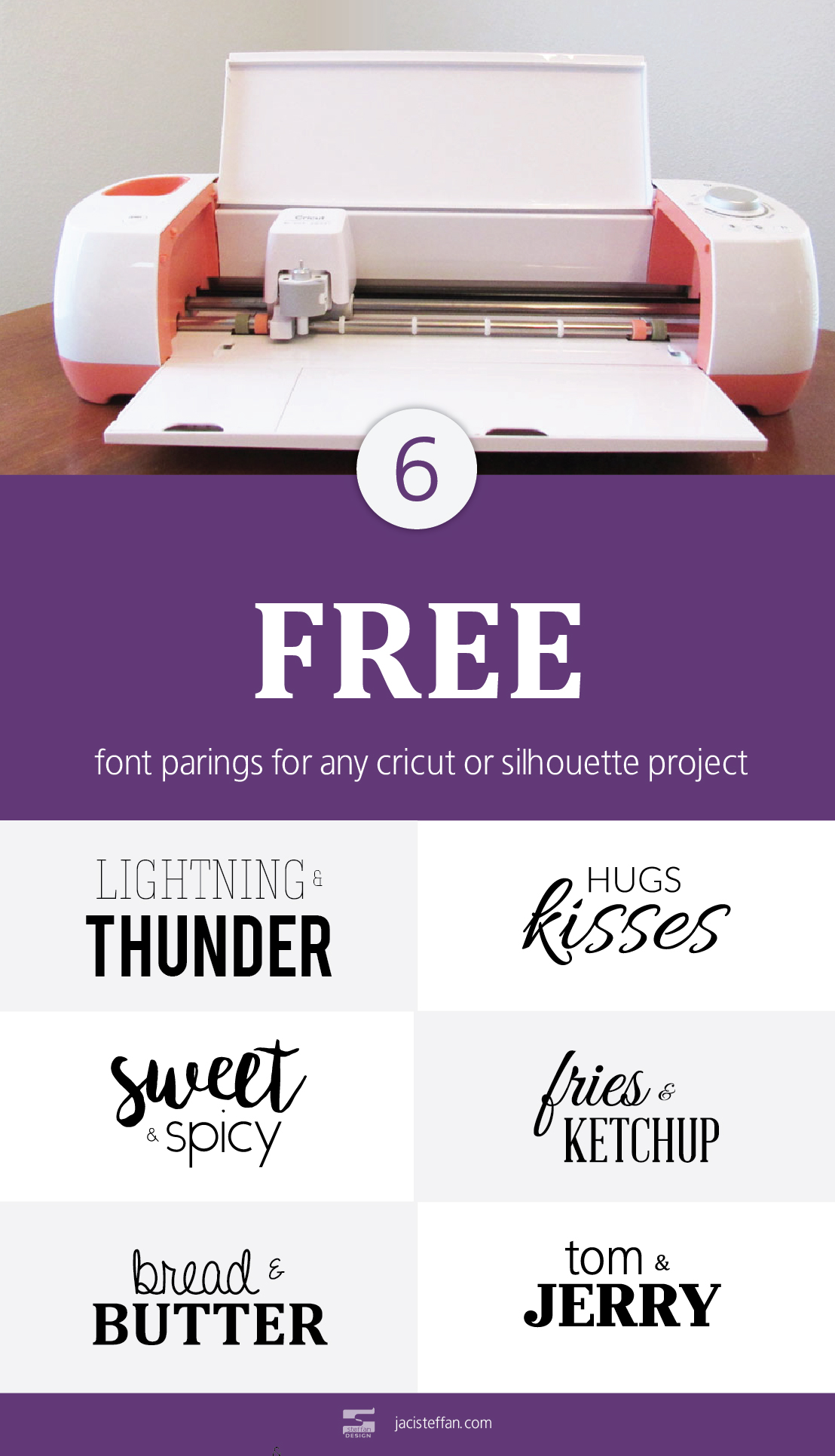
Lightning & Thunder  • Sweet & Spicy  • Bread & Butter  • Hugs & Kisses  • Fries & Ketchup • Tom & Jerry

These fonts are free for personal or demo use. If you plan on using them to create a project that you will be selling please make sure that the fonts you use are free for commercial use. If they are not please be sure to purchase the fonts on the designers respective sites. The fonts provided in this list are the property of their respective owner.

Tips for Combining Fonts

  1. Do opposites really attract? Well, they do when it comes to fonts! Combining script fonts with san-serif and serif fonts provide great contrast.
  2. Hierarchy is a very important part of design. A great way to create visual hierarchy is to pair a heavy weighted font with a light weighted font. This makes the heavy weighted and font pop out which creates visual hierarchy.
  3. Be careful combining similar fonts. Just because a couple fonts look similar it doesn’t ensure they will look good together. Avoid parring multiple san-serif fonts or multiple serif fonts together.
  4. Limit the number of fonts combined in a single design. Having a large variety of fonts in a single design can lead to visual confusion.

Successfully combining fonts is a matter of trial and error. Don’t feel like a failure after trying just a couple combinations. Like everything in life, practice is the best way to get better at combining fonts.

What are your favorite free fonts to combine together?

Recommended Posts
I don’t know about you, but of all of the rooms in my house I spend the most time it my kitchen. One of my favorite activities to do with my son is making cookies. When it comes time to make meals and especially baking having uniform containers makes it a lot easier. I have uniform containers for my sugar, flower, baking soda, baking power, cocoa, and chocolate chips. Taking my uniform containers a step further and adding simple kitchen labels has definitely increased my productivity. With my toddler “helping” me cook one never knows what can happen in just a few short seconds. This post contains affiliate links. If you click and make a purchase, I may receive a small commission, at absolutely no extra cost to you. Read my full Disclosure Policy here. Organization Saves Time in the Kitchen Growing up my mom had containers for all of her baking ingredients. It made the baking process go much faster. When I first started baking with my son my baking and spice cupboard quickly turned into a mess! These Snapware containers were the answer to my problem. They are airtight stack-able containers that come in a variety of sizes, perfect for storing my baking ingredients and pantry items like pancake mix and rice as well as my powder laundry detergents and can be purchased on amazon.com. Click on images to view on amazon. Simple and Easy to Use Kitchen Labels Shortly after adding my baking powder, baking soda, and corn starch to the same sized containers I quickly realized that it was hard to tell the difference between the 3 ingredients by sight. So, I came up with these kitchen and pantry labels to solve my problem and better organize my kitchen. These simple looking and easy to use pantry labels can be printed on a sheet of label paper or cut with a die cutter like a Cricut or silhouette. Label paper can be purchased at any store that sales office supplies like Staples, Office Depot, Walmart or online at Amazon if you are like me and don’t want to take time to go to the store. I cut my kitchen and pantry labels with a Cricut. You can follow my step by step tutorial on how to cut SVG files with the Cricut Design Center. You can purchase my pack of 12 simple kitchen labels for $3.50 or my pack of 24 simple pantry labels for $5.50 at my etsy shop. View Kitchen Labels (12 labels) View Kitchen & Pantry Labels (24 labels) What are some ways you have increased productivity in the kitchen though organization? [...] Read more...
Logo design is a big part of our ever day life even if we don’t always realize it. We see logos on the grocery’s we’ve purchased, appliances in our home, vehicles we travel around, billboards and stores we pass on the way to our destinations and websites we browse throughout the day. The logo mark is one of the most important parts of branding a company. Logos can tell your customs a lot about your company at a first glance. They are the best way for a company to build awareness, loyalty, and give customers an idea of what the company is about. 1. Keep Your Logo Simple Since we see logos everywhere all day long it is important to keep logos simple. For example it is much easier to memorize the title of a book vs the summary on the back. The title is easier to remember because it is short, simple and in most cases describes what the book is about. There is a lot to be said about simple logos. Simple logos are easier to remember and recognize from a distance. In the long run they are more likely to create a lasting impression. 2. Always Design in Black and White First One of the most important rules of logo design is if your logo looks good in black and white it will look better in color. Textures and colors may not always be visible when printed or applied to different mediums. Logos defendant on color or texture it will lose their recognition when printed in black and white. Deigning logos in black and white will also help keep focus on the overall design. 3. Design With Scale In Mind In today’s world logos are placed on a wide variety of mediums from products, receipts, marketing ads, mobile apps, websites, store fronts and billboards. It is important for logos to be legible whether they are put on something as small as a chap stick container or as large as a billboard. 4. Take Time to Sketch Your Ideas Now that we have some rules to follow get out a piece of paper, pencil, eraser and tracing paper. Even if you are terrible at drawing do your best. Sketch every logo design idea you can come up with even if it doesn’t seem like a good idea. Sketching all ideas will help clear your mind and come up with new ideas. Once several ideas have been drawn look at them and see if elements or concepts can be combined to create new versions of the logo. Tracing paper is very useful in this phase of the process. It allows you to trace an element or concept and put it over the top of other ideas to see if different ideas will work 5. Design Logos in Vector Having a vector version of your logo ensures that it will follow the scaling rule outlined in #4. Vector is different from pixels because unlike pixels vector is mathematically calculated so that no matter how large or small your logo is it will always have smooth lines. Vector file formats are AI (Adobe Illustrator), EPS, and SVG. Whether you design your own logo or have a designer create a logo for you make sure a vector version is provided. 6. Use Legible Typography Typography is an important part of logo design.  Make sure that the font(s) you choose match the demographic you are targeting. The font must be legible from a distance or when printed on a small product. Another aspect of typography is the spacing between letters. Make sure that your letters have enough spacing between them but not too much. Having the right amount of spacing increases legibility. Designing logos is a fun but challenging aspect of design. Good logos require a lot of  time, trial & error and strategy. Since logos are the initial face of a company having a simple, easy to read, and memorable logo will help create customer trust. Customer trust in turn results in a successful business. Following these 6 rules of logo design will put you on the path to designing a strong recognizable logo. View logos I have designed [...] Read more...